Since February 2017, a team of 10 officers at GovTech has been mystery-shopping government websites — about 700 of them — to see if they are easy to use and understand for citizens. The team also works with the public agencies to fix any website issues.
The GovTech Digital Shopfront team has several functions: raising the standards of government digital services, checking for compliance (e.g., by way of mystery shopping), tracking agencies' progress in meeting standards, responding to agencies' queries and advising on technical aspects where necessary.
The aim: to raise the overall usability of these websites. After all, if the Public Service is to be serious about public sector digital transformation, government websites have to be simple, accessible and user-friendly.
The websites are assessed based on a set of technical standards that apply to the Public Service and incorporates international standards such as the Web Content Accessibility Guidelines. This initiative also sees government-wide collaboration, as all agencies make efforts to enhance the usability of their websites. GovTech also has plans for a central platform to allow simple websites with unchanging informational content to test and achieve usability quickly and cost-effectively.
The GovTech team, as well as the public agencies that have revamped their websites, share with Challenge what they have learned about improving usability.


2. Prioritise critical content to be displayed above the fold (the portion of the web page that is visible in a browser window when the page first loads) and provide cues to indicate that there is more content below the fold.

3. Test for broken links, broken images or breaks in the transactional workflow for the user. To ensure a seamless experience, try various user workflows and scenarios for uses of the website.

4. Use a conventional design that users are familiar with. Using existing design patterns and gestures reduces the need for users to learn new ways of navigating.

5. Constantly provide feedback and cues to users. Buttons should look clickable, form labels should be clearly stated (outside the text fields), and error messages should be succinct and shown near the field with the error.

6. Optimise images wherever possible. This will help to ensure image quality and the site will load faster too. Adding descriptive alternate tags for images and videos will also enable greater accessibility.

7. Create a consistent experience. Ensure that websites are mobile-responsive and compatible across different platforms (e.g., mobile devices, operating systems).

8. Provide effective assistance to users so that they can do self-help and find answers immediately (e.g. chatbots, frequently asked questions).

9. Establish the website's purpose, and apply user-centric design. Ensure that key actions required are clear, and information is easy to access. E.g. use clear calls to action (with prominent buttons/links) and navigational link labels.

10. Make it easy for users to view content. Provide enough contrast between the text and background, make font sizes large enough to read, and differentiate text links from the body text.
1. Immigrations & Checkpoints Authority (ICA)
The Immigration & Checkpoints Authority (ICA) obtained valuable insights from their usability tests and focus group discussions with customers. Before, the website categorised information and services according to the ICA's three Service Centres. Now information is organised according to customer personas and uses simpler language. The site has also been redesigned to be mobile-friendly and with more intuitive navigation, making it easier for users to find information on their own.
2. Housing and Development Board (HDB)

3. Islamic Religious Council of Singapore (MUIS)
The Islamic Religious Council of Singapore (MUIS) used to offer key informational services across 12 different websites. Now the content is streamlined and organised within one MUIS portal. The portal has also been redesigned to be mobile-friendly, making it easier for users to access the various services from a single website.
4. Singapore Statutes Online (SSO)

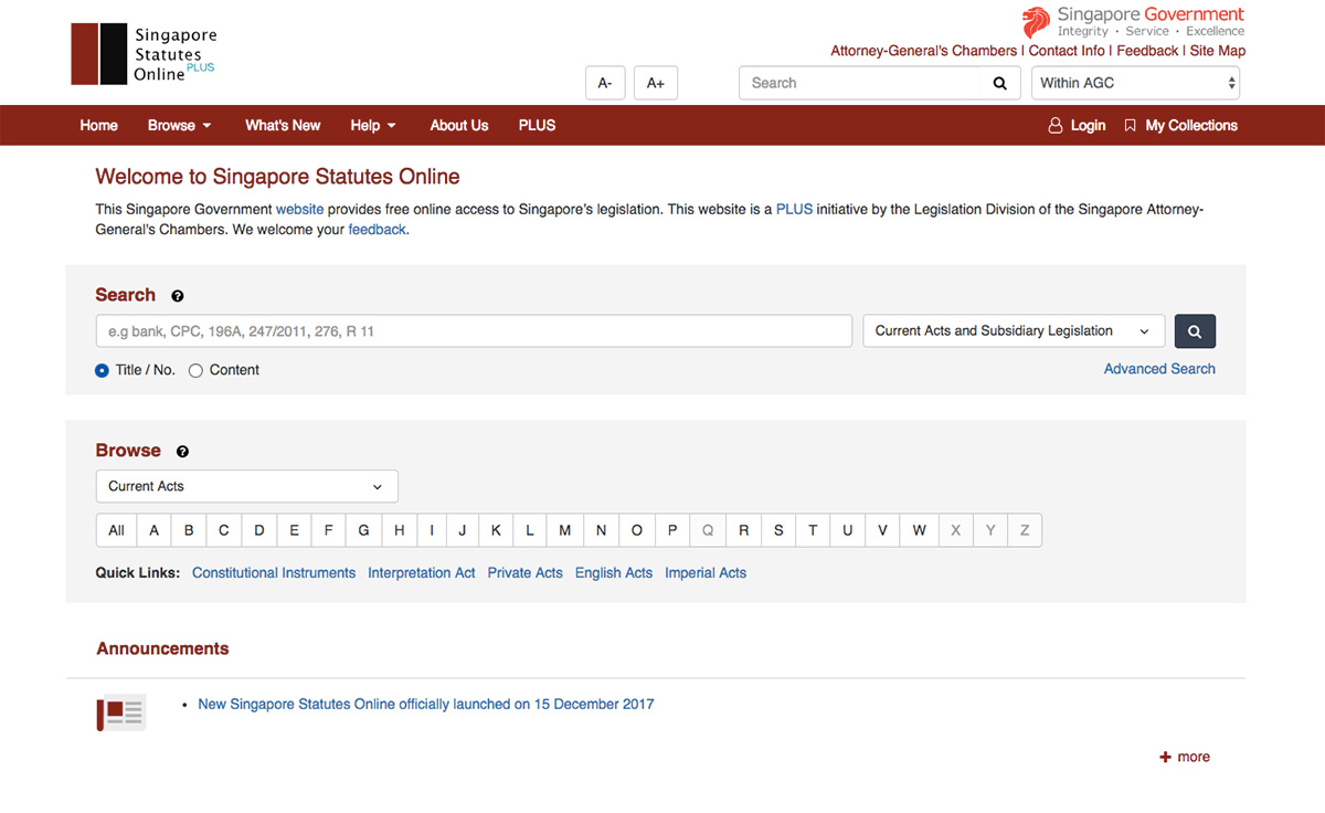
The Singapore Statutes Online (SSO) by the Attorney-General's Chambers (AGC) has been revamped to enhance the public's access to Singapore's written laws. The revamp was based on two public surveys that the AGC conducted to better understand the public's needs and expectations.
The revamped SSO has a clean design, prominent labels and a good information architecture, and is mobile-responsive. Its enhanced search features also make it easier for laypersons to find relevant legislation. Usability tests show that users are better able to identify and locate information on the website.
5. Public Transport Council
The Public Transport Council's website has been redesigned to be mobile-friendly and have better navigation, making it easier for the commuters and other users to find out about public transport regulations and fare policies.