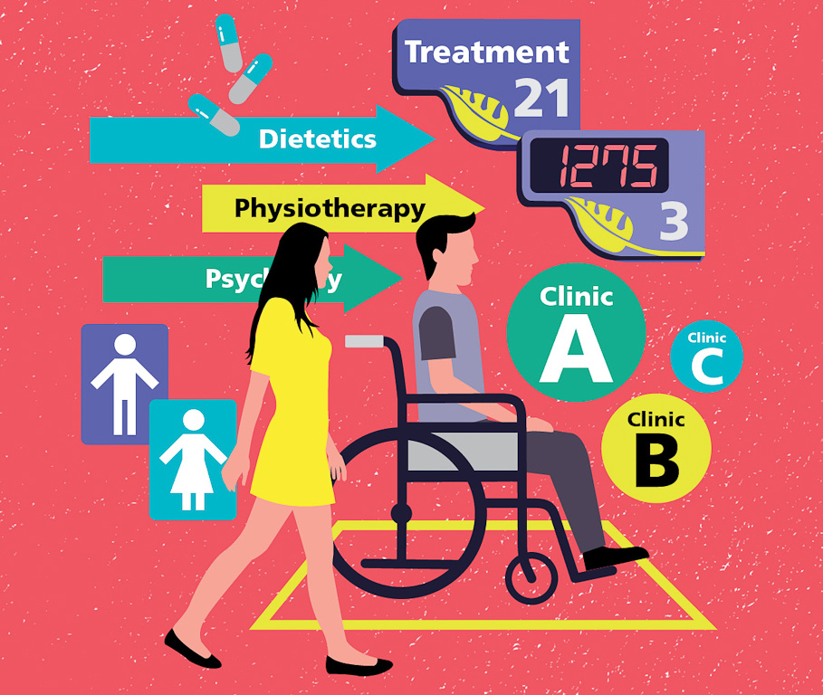
Patients and visitors to the Singpore General Hospital (SGH) used to struggle to find their way through the labyrinth of similar-looking rooms that is the Specialist Outpatient Clinics (SOC) at Block 3.
Confusing signs, poor layouts and tight corners for wheelchairs were some of the complaints that have surfaced in the past.
Realising this problem, a team of 12 comprising staff from SGH’s facilities development, housekeeping, infection control and safety network departments, as well as external consultants, came together in 2011 to find ways to help people move around easily – a design process called wayfinding.
For a year, they gathered feedback from doctors, nurses and patients on which areas caused difficulties, and mapped out a sequence of activities and touch points that characterise a patient’s experience.
One of the major changes they made was to merge three clinics on Basement 1 into a single integrated centre to give patients seamless care. The new Centre for Digestive and Liver Diseases (CDLD) was completed early last year.
“Prior to merging the three clinics,” says Ms Wong Yoke Sim, Senior Project Manager, Facilities Development, SGH, and who was part of the planning team, “patients had to navigate from one clinic to another, which all had individual registration counters.
“Patients also faced confusion when the doctors directed them to visit another room for tests, as it could be in another clinic.”
So SGH broke down the walls between the clinics, and combined registration counters and waiting areas. Patients can now consult the doctor, have various procedures done and make payment in a single location.

To make it easy for patients to find their way around, the team used colours to create zones in the centre to highlight the various medical disciplines. The walls, doors, chairs and signs within a zone share matching colours.
“Some elderly patients are unable to read, so colour-coded walls and chairs, for example, are a better way to demarcate areas rather than highlighting medical disciplines,” says Ms Wong.
New signs use larger text, high colour contrast and pictograms to make them easier for patients to read.
Similar changes have also been made to Level 1, which houses several SOCs. At the entrance, there is now a coloured floorplan with the location of clinics and amenities displayed at eye level for wheelchair users. The new clinic signs are also colour-coded to match their colour on the floorplan.
Elsewhere in SGH, one of 16 SingHealth institutions, other works are underway to make it simpler for patients to find their way around.
As a key part of a big exercise to make all SingHealth institutions more agefriendly, a team of 15 staff from across SingHealth came up with a design manual. The SingHealth 10-Point Plan details how to improve healthcare infrastructure design and wayfinding at 10 interaction points during a patient’s visit, from entry to exit.
The manual was completed in 2014, after two years of studying the Building and Construction Authority (BCA)’s Accessibility Code and gathering feedback from patients, visitors and hospital staff. The team also consulted local and overseas specialists in low-vision mobility and Universal Design experts from the BCA.
“In the past, we used to maximise the number of chairs we had in the waiting areas to cope with the crowd, but we realised this left little room for those in wheelchairs,” says Ms Yong Seow Kin, Director, Facilities Development, SingHealth, who is part of the team who developed the SingHealth 10-Point Plan.
“[The manual offers] recommendations on how to arrange the chairs, the distance between them, where to position wheelchair users, and even the chair specifications.”
These guidelines came in handy during the SOC renovations.
For example, the waiting rooms at the new clinics now have seats in the front rows clearly marked for the elderly and also space for wheelchair users.
To address the needs of wheelchair users, the consultation rooms in the clinics were enlarged and now come with wider two-leaf doors.
There is also a video loop playing in the clinic to help kidney patients who need to take multiple urine samples daily to recall their steps.
But the process of making navigation simple is not always easy. For one thing, working within an existing, decades-old, space posed certain constraints, says Ms Wong.
For example, the team was not able to widen the toilets within the CDLD according to the guidelines.
“Sometimes it was not possible to follow the plan strictly, so we took what worked best for each unique space. The bottom line was that patients’ needs and ability to manoeuvre are not compromised,” she says.
Careful planning also had to be done for the renovation of the CDLD as it was done while operations were still running. Works were carried out in six phases – mostly in the evenings and on weekends – for a year.
But judging by the ease with which patients are now moving around and the time saved, having a good wayfinding system in the hospital is clearly the way to go.