Library@Orchard: Deliberately Designed With Users In Mind

“We’re curated from the inside out,” said Ms Chan Wai Ling, the manager of the new library@orchard, as she led Challenge on a tour of the double-storeyed space one morning.
She – along with Senior Project Manager Cheong May Fong – were pointing out the deliberate touches that gave the library its distinctive look and feel.
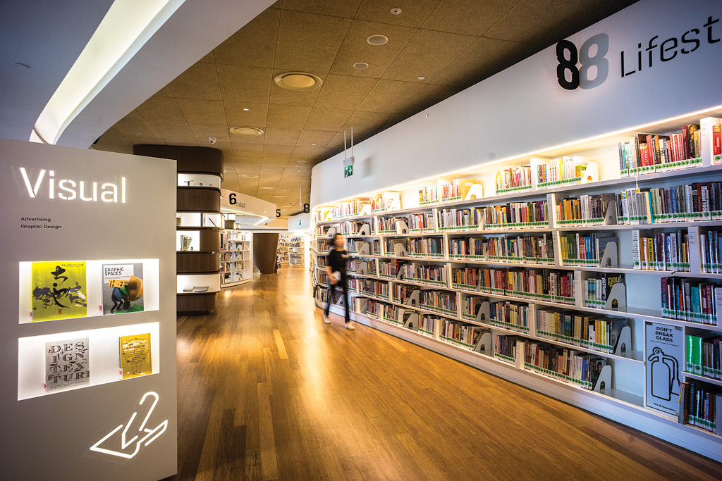
The curved bookshelves, the buffed bamboo floor and the bespoke reading cocoons, she said, were all firsts for Singapore’s public libraries.
Ms Cheong pointed out that “we tried to keep everything that is vertical (like the shelves) neutral and white”. This allows the library to give prominence to the books and magazines, the “main actors”. In contrast, the horizontal floors and ceilings are in warm, brown tones.
With such designer looks, the library is likely to be Singapore’s most Instagrammed reading space.
But the pair stressed that their careful curation (they used the word a lot) went beyond the aesthetics.

A careful selection
Built on the theme of “Design is for everyone”, the library has a collection that spans fashion, interior design, architecture, photography, travel, culture, and the culinary arts, among others.
The decision to focus on design and lifestyle arose during the year-long design process undertaken by lecturers and students of Singapore Polytechnic and the National Library Board (NLB) staff.
Their user-focused methodology included in-depth interviews with 100 people who worked or lived at Orchard Road, and surveys with over 1,000 more library users at a prototype exhibition in 2012, to understand what library goers want.
The librarians were also roped in for their “special skills”, revealed Ms Chan. One of them, who has an industrial design degree, leads sketching and craft sessions on alternate Wednesday evenings. The other two majored in literature and animation, respectively.
Ms Chan joked that she is the only one who was not “curated”. But the quirky librarian – who was sporting a strip of silver-ash hair that day – was surely handpicked for the job. On the NLB’s website, she has purple ombre hair and calls herself the “library honcho”. Not at all the stern, finger-shushing librarian we often have in mind.

Nudging good behaviour with design
In fact, there are no “Please be quiet” signs here. The librarians are relying on physical design to modify behaviour – an insight from the design thinking process.
The first floor, with its central arena seating area, is designed to be a more “open” space where film screenings, workshops and other activities are carried out. Soundboards in the ceiling help to manage the sound level.
The second floor has single-seated reading cocoons for those who want to retreat into a quieter space. There is also a row of chairs – each pair facing one another – that is tucked behind bookshelves for added privacy. Enter the space and a perceptible hush envelopes you.
“If you sit inside, you’d naturally want to ‘behave’ because the person opposite is in such close proximity,” said Ms Chan. “We want to encourage them to be civicminded, rather than putting up ‘Do not talk’ signage.”
There are no random stickers or posters in the library, “to keep the place clean in line with the design language”, she added. Interactive digital signboards are used to promote books or events.

Details do matter
The library@orchard also developed its own brand identity, including its logo, to be distinct from the NLB’s. Staff wear black tees bearing the library’s logo.
Even the checkout counters match the library’s aesthetics: the signs are in black and carry the branch’s logo. There are cheeky icons (“Do not place teddy bear here”) on the black checkout mat, while a simple icon of a barcode indicates where users can scan their borrowing cards.
“We credit our users’ intelligence to be able to understand the icons,” Ms Chan said of the minimalist approach.
The brand identity permeates as many aspects as possible, including the tongue-in-cheek “Don’t break glass” sign on the fire extinguisher panels.
These details might go unnoticed by most users but Ms Chan insisted, “It’s important to be particular about details so that everything looks put together.”

(Right) The audio-visual materials section is arranged so that the titles on the spines can be read easily.
An adaptive space
Just like its predecessor, which closed in 2007, the new library@orchard is an escape from the overly stimulating Orchard Road. Young people enjoy hanging out at the arena space on the first floor, while those craving privacy escape to the second level.
“Very beautiful,” said a finance professional who had dropped by before his appointment and walked out with a book. “I don’t usually come to the library.”
A woman, who was taking a break from work, said “it’s big and quiet”, compared to her neighbourhood library.
The users have quickly settled into the space and even modified the library’s original design features.
Ms Chan pointed out that recessed boxes at the open arena were originally meant to display large books. But the librarians quickly noticed that users were leaving browsed books in them instead. Now the boxes have become the de facto return bins. Similarly, the display shelves next to the reading cocoons have been claimed by users for the same purpose.
But the librarians aren’t complaining. “We constantly adapt our processes to user behaviours so that the spaces will be natural to them,” said Ms Chan.
After all, the library was designed with them in mind.
Other Stories: The Design Issue
- POSTED ON
Mar 17, 2015
- TEXT BY
Bridgette See
- PHOTOS BY
Catspace
-
Deep Dive
Strengthening Singapore’s Food Security
-
Deep Dive
From Liveable City to Lovable City


