Artfully Designed: The “Invisible” MRT Station Features That Enhance Our Rides
In the hustle and bustle of our daily lives, it's easy to overlook the small details that make a big difference in our daily routines. Singapore's MRT system is a lifeline for many commuters, offering a fast and efficient way to navigate the city.
While we may be familiar with the basic amenities of these stations, several citizen-centric features might go unnoticed.
Have you noticed, for example, that for all MRT stations on the Thomson-East Coast Line (TEL), the lift buttons are back-lit in blue until they are pressed? They then turn a contrasting red, helping to verify that the correct button has been pressed.
“Lift interiors are mostly in stainless steel, providing little colour contrast. For some people, it can be challenging to identify the right buttons and ascertain whether the button has actually been activated. Backlit buttons that change colour when pressed provide assurance to commuters that they have pressed the right button,” says Ms Tan Swee Lin, Deputy Director (Architecture) at the Land Transport Authority (LTA).
The MRT system is designed to be inclusive and accessible to people of all backgrounds and abilities. To better serve commuters, Swee Lin’s team actively works with Social Service Agencies (SSAs) and commuters to understand the needs of commuters with different abilities.
Accessibility for All
Several stations such as Bishan, Bedok, Outram Park and Chinatown have escalator safety reminders in dialects like Hokkien and Cantonese. This caters to the older population that frequents these stations, allowing them to feel comfortable navigating the stations and injecting a sense of familiarity.
For newer stations on the TEL, exits are labelled with numbers instead of letters. Numbers are universally recognised by people with different primary languages and this makes navigation easier for a diverse range of commuters.
With newer stations having more exits, it is also easier for commuters to look for a numbered exit when signs show a range of numbers, compared to letters.
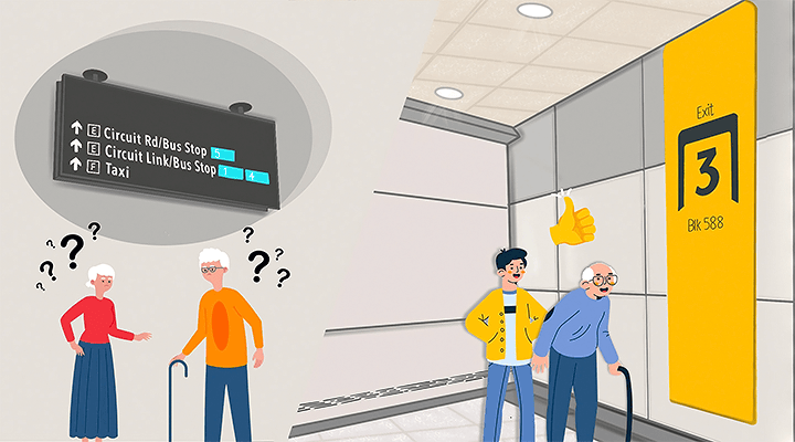
These numbered signages on the TEL is one of Swee Lin’s favourite new features. Besides the new labelling system, the overhead signs use larger icons and font sizes, and have higher colour contrast and less clutter. The signage has received positive feedback from the SSAs who joined the LTA on station walk-throughs before the new stations opened.
“The signs enable the SSA communities to navigate more independently on the MRT network,” says Swee Lin.
For those with visual impairments, the TEL stations have Braille and embossed text incorporated onto the handrails of public staircases and ramps. This tactile information ensures that people with visual impairment can navigate the stations with ease and confidence.
Platform seats at the TEL stations also have armrests for commuters who need help getting up from the seat, and backrests for more support. The seats are designed with bright, contrasting colours and materials to help busy commuters spot them easily and prevent accidents.
Enhancing Wayfinding
Navigating the sprawling MRT network can be a challenge, especially for tourists or those unfamiliar with the area.
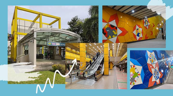
To make navigation more intuitive, MRT stations strategically incorporate colour to shape the identity of each station. This colour-coding allows commuters to more easily confirm their destination, arrange meet-up points or simply navigate the station more efficiently.
Public Art in Transit
But the use of colour isn't the only way to enhance wayfinding in MRT stations.
Integrated art and design elements also play a role in helping commuters orientate themselves within MRT stations. Commuters often use the artworks to create their own landmarks and mental maps, so they can navigate the station with ease, Swee Lin says.
At the Little India station, near LTA’s headquarters, a commuter was heard telling her friend that she looks for the “elephant” (stylised animal paintings in Memoirs of the Past by S. Chandrasekaran) to get to the correct escalators for her route.
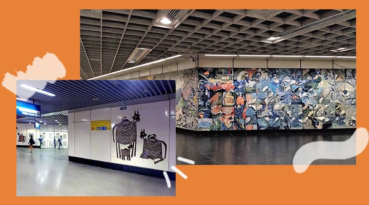
Dhoby Ghaut station features Interchange by Milenko & Delia Prvački, which Swee Lin enjoys as it also serves as a wayfinding cue. “You know you’re on the right track towards the North-South Line, from North-East Line platform, when you walk past Milenko’s mosaic wall and then Delia’s ceramic wall.”
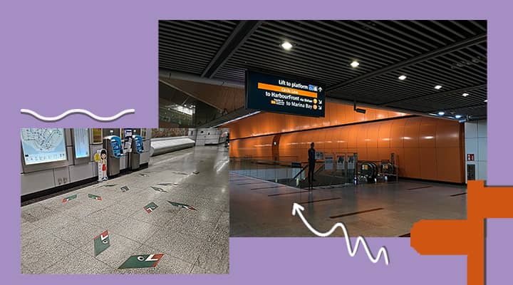
Over at Ubi station, sketches of tapioca leaves, flowers, seeds and roots can be found on the station floor. These subtle art elements guide the flow of traffic toward key areas like elevators and staircases.
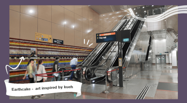
Similarly, Promenade station incorporates kueh-inspired patterns in “Earthcake”, an artwork by Ana Prvački. Besides beautifying the space and honouring the area’s geology, the various layers also help commuters differentiate the different platforms.
Art that Roots the Community
Beyond aesthetics, public art also serves to highlight the heritage and spirit of the area, contributing to the community’s shared history while adding vibrancy to the daily commute.
For example:
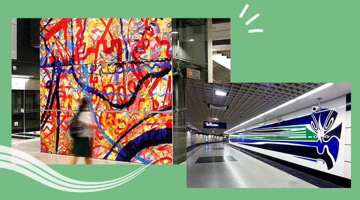
- At Outram Park station, "Memories" by Wang Lu Sheng reflects the area's history as a Chinese immigrant enclave, through motifs of Chinese opera.
- Pasir Panjang station features mock movie posters that promote a fictional film about Lieutenant Adnan Saidi, a World War II hero who fought in the area.
Doing Double Duty
In Singapore, several MRT stations are more than just transit hubs. They double as civil defence shelters that seal off with blast doors during emergencies. These shelters even have decontamination facilities for those seeking refuge.
The city’s low-lying geography makes it prone to flooding during heavy rains. To counter this, all MRT station entrances and exits are elevated to more than 1m above the adjacent road level. Many stations also have flood protection barrier systems to ensure that commuters stay safe and dry, and trains run smoothly.
Enjoying The Journey
While our daily commutes may sometimes feel routine, Singapore's MRT system offers hidden treasures that make our journeys more comfortable, accessible and enjoyable.
To learn more about these features, the LTA has several publications available – find these online or at public libraries. You can also arrange for walking tours to get up close with the art.
So the next time you hop on the MRT, take a moment to appreciate these thoughtful features that often go unnoticed, and let them enhance your daily commute.

For more stories like this, subscribe to the Challenge newsletter or follow the Challenge Telegram channel.
- POSTED ON
Oct 13, 2023
- TEXT BY
Siti Maziah Masramli
Erin Liam
- PHOTOS BY
Land Transport Authority
ZKang123 (CC BY-SA 4.0)
Tuber


